Artist: Benjamin Hirte
Exhibition title: Condo New York 2018: JTT hosting Galerie Emanuel Layr
Venue: JTT, New York, US
Date: June 29 – July 27, 2018
Photography: all images copyright and courtesy of the artists, JTT, New York and Galerie Emanuel Layr, Vienna/Rome
Huntington Beach
There was a guy across the street at the traffic light on my way to the public pool in the morning. He was on his bicycle wearing a black shirt that said “Huntington Beach” in quite dramatic illustration. The person looked more like a “biker” than a cyclist, his face from what I could tell had traces of regular alcohol consumption and he was not an athletic type. The bicycle was just a necessary tool to get from A to B. From my experience such T-shirts state something with little to no relation between an actual place and a person wearing it. I looked it up later and found that Huntington Beach is a picturesque town on the West Coast south of LA. The T-shirt did not look beach-like either, more like one a “biker” would wear. I wondered what made him buy the fake “Huntington Beach” memorabilia or better yet what did not keep him from buying something that he obviously had no connection to, but that would propose a connection to a particular way of life.
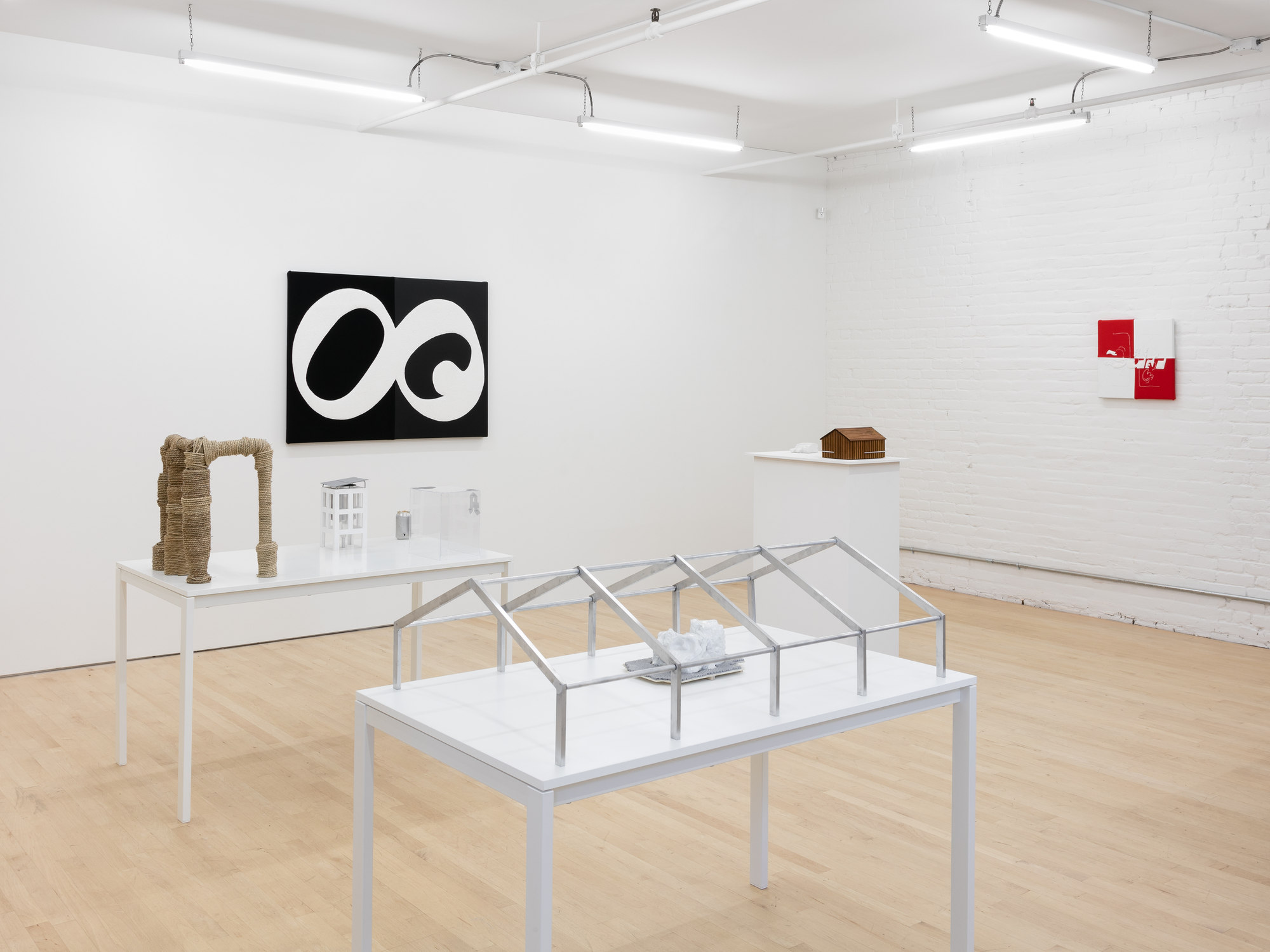
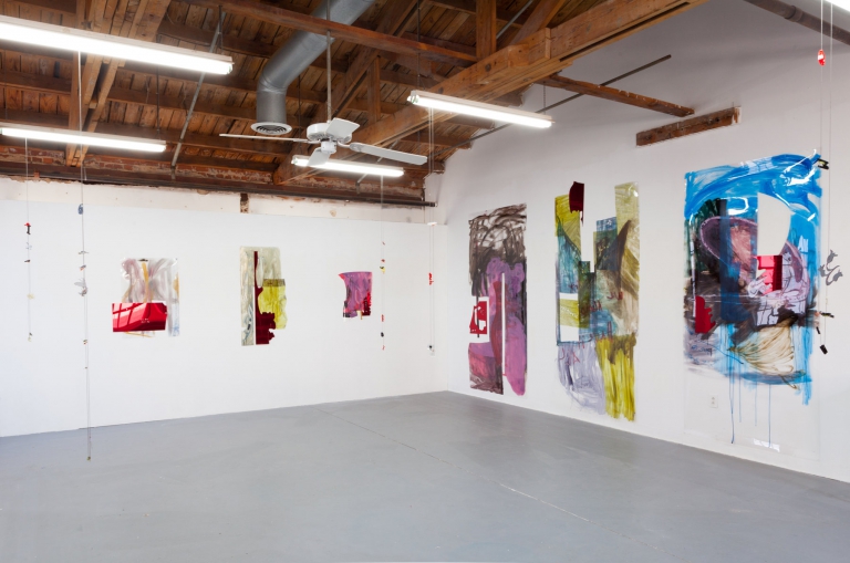
The miniatures and graphic wall works reflect my interest in language, the media, the construction of normality and the role of a person in the center of this endlessly evolving environment. lt also plays with the idea that between the image and the letter would lie the world of cartoons. A world of simplification and abstraction of complex images, texts, facts or shapes.
The small models and objects are placed on two tables, a plinth and a window sill. Language is sampled with parts of the human body and relics of industry and distribution. The three canvases are produced in the style of the American letterman jackets (alias college jackets, varsity letter jackets etc.) from feit, leather and terry cloth, which is the standardized construction of the varsity letter. The larger black and white pieces show ligatures of two letters/symbols: the small “g” from the original Google logo and the paragraph sign §. (In Europe it denotes “the law.” In the US it’s a symbol for jurisdiction). The way they are hung they appear like skeptical or even angry cartoon eyes. Those two symbols and their merging to me symbolizes the failing promise of a new connection between things through a more democratic flow of information.
The smaller red wall piece includes the ragged logo of the British tabloid “The Sun”. Other insignias from popular news media are used as negative shapes around it. Do I have a good reason to prominently include the “The Sun” logo? lt’s an absurd newspaper … it stands for a certain genre of news that pushes things into absurdity (into the world of cartoons?), while still shaping popular opinion.
I remember when I was in LA in 2011 (it was a little after HRC’s first candidacy) a newspaper (not “The Sun”) lying at the counter at Ralphs, stating in big letters that Bill Clinton had HIV. I remember the first thing I thought, “then Hillary has it, too.” Later on I mentioned it to a friend, who had never heard of it. I googled it. Nothing. lt was just quite bluntly a lie, based on a rumour and propagated by somebody that wanted to start a rumour. lt resurfaced when Hillary ran again. lt was my first experience with intentionally false information of such brutality on a public political person and it was lying around in the most ordinary place, as if it would be the fucking weather. This was new to me.
I am only theoretically firm with the institutional function of letterman jackets in the USA. Personally, I know the letterman jacket as part of German youth culture in the Nineties, often related to American hip hop and rap culture with German hip hop on its (very limited) rise.
We didn’t have a particular lived relation to the letters or initials on the jackets, caps and other items we would wear. Aspiring to a certain dominant pop culture, we were left with choosing teams by colour, look or by towns we had never been to.
I remember having a classic college jacket in black and white with the letter “Y” on it. I don’t think it was an official logo of anything, besides pretending to be from Yale … I have a positive memory of these clothes, as they were part of a vivid time of my youth, engaging with Hip Hop, Graffiti and Skateboarding. Thinking of its actual function in US schools and colleges, it is somewhat embedded in a more problematic narrative: ideas of success, hierarchy and identification.
There are two fictional models dealing with issues of the body in its environment that caught my attention in the last years. They contradict each other as much as they compliment each other (not an unusual situation these days). First: A fictional human body designed to survive a car crash. Its bones, muscles, body parts are shaped according to tests in the auto industry .. The result of this is a very uncomfortable looking specimen. An absurdly thick neck, an upholstered head to protect the brain, some zysts like sacks between the ribs and very short feet. The other one is the “Sensory Homunculus.” The homunculus is commonly used today in scientific disciplines such as psychology, as a teaching or memory tool to describe the distorted scale model of a human drawn or sculpted to reflect the relative space human body parts occupy on the somatosensory cortex (the “sensory homunculus”) and the motor cortex (the “motor homunculus”). If you illustrate the sensory impulses into the representation of a body you get an image of a body. A goblin-like human with, as to be expected, large hands, large sexual organs, huge lips and eyes, etc … Both of these models incorporate the idea of vectors and impulses towards a body, but in a conflicting way. I enjoy the idea of these two characters co-existing, hanging out. One is hypersensitive, the other one overprotected, which is anyway related. In the way each emphasizes different body parts, their shapes become a negative and a positive.
– Benjamin Hirte
Benjamin Hirte, Condo New York 2018, Installation view, JTT, New York
Benjamin Hirte, Condo New York 2018, Installation view, JTT, New York
Benjamin Hirte, Condo New York 2018, Installation view, JTT, New York
Benjamin Hirte, Condo New York 2018, Installation view, JTT, New York
Benjamin Hirte, Condo New York 2018, Installation view, JTT, New York
Benjamin Hirte, Condo New York 2018, Installation view, JTT, New York
Benjamin Hirte, Factory, 2018, Recycables, seagrass rope, 43.18 x 48.26 x 30.48 cm
Benjamin Hirte, The weather, 2018, Felt, leather, terry cloth, 45.72 x 45.72 x 317.5 cm
Benjamin Hirte, The google paragraph (white in black), 2018, Felt, leather, terry cloth, 91.44 x 121.92 x 3.81 cm
Benjamin Hirte, The google paragraph (black in white), 2018, Felt, leather, terry cloth, 91.44 x 121.92 x 3.81 cm
Benjamin Hirte, Condo New York 2018, Installation view, JTT, New York
Benjamin Hirte, Shack, 2018, Wood, stain, aluminium, steel, 27.94 x 20.32 x 15.24 cm
Benjamin Hirte, Ribs, 2018, Plaster, lacquer, 15.24 x 10.16 x 5.72 cm
Benjamin Hirte, Barrel, 2018, Can, aluminium, straw, 114.3 x 7.62 x 7.62 cm
Benjamin Hirte, Water tower, 2018, Wood, aluminium, plastic, paint, 15.24 x 15.24 x 27.94 cm
Benjamin Hirte, Apotheke / Pharmacy, 2018, Plexiglas, tape, aluminium, steel, 25.4 x 22.86 x 17.78 cm
Benjamin Hirte, The strong Left / Die starke Linke, 2018, Aluminium, plaster, lacquer, paint, wood, ceramic, 109.22 x 68.58 x 30.48 cm
Benjamin Hirte, The strong Left / Die starke Linke, 2018, Aluminium, plaster, lacquer, paint, wood, ceramic, 109.22 x 68.58 x 30.48 cm
Benjamin Hirte, The strong Left / Die starke Linke, 2018, Aluminium, plaster, lacquer, paint, wood, ceramic, 109.22 x 68.58 x 30.48 cm
Benjamin Hirte, Temple with three entries, 2018, Styrofoam, metal, 33.02 x 33.02 x 30.48 cm
Benjamin Hirte, Temple with three entries, 2018, Styrofoam, metal, 33.02 x 33.02 x 30.48 cm
Benjamin Hirte, Condo New York 2018, Installation view, JTT, New York


