
Artist: Matt Ager
Exhibition title: GUSTO
Venue: Studio_Leigh, London, UK
Date: November 10, 2016 – January 14, 2017
Photography: all images copyright and courtesy of the artist and Studio_Leigh, London
There is no Polo Maldini website. There is no Wikipedia entry. But I’ve seen the brown Polo Maldini loafer in Matt Ager’s studio and I’ve tried to find out more. I’ve never encountered a shop that sells them but I’ve held the surprisingly light, chisel-toed shoe in my hand. It’s extravagantly stitched, the leather is shiny and hard, there’s a sunburst gradient of tonal browns, a rubber tread moulded from a snakeskin pattern for extra grip. Polo Maldini is emblazoned across the insole. Its large typeface tells you everything you need to know.
It’s a vertically stretched serif font, with a mid-20th century gravitas that exudes unquestionable quality. A cut price approximation of the Ralph Lauren font, surely. Vidaloka or ITC Fenice, perhaps? In white, against a black background it strikes a classy tone. Polo Maldini sounds good and it looks good too. Evocative and unashamedly capable of seduction. Luxurious yet familiar. Timeless. Italian. What exquisitely good taste. Very Prima Gusto.
There’s a trickle of activity on style forums. People asking questions and looking to the internet to assuage any doubt that this really is the exclusive brand they believed it to be. Anxieties about the authenticity of the company are aired. In reply it is suggested that maybe they’re unknown outside of the town where they are made (also unknown), affirming exclusivity and allaying any deep-seated fears or regrets about purchases made. Questions about the quality of the shoes emerge with a quiet desperation. ‘I’m sure this leather will soften’… ‘Rubber tread is definitely a pragmatic decision, these are stylish and practical’… ‘They’re Polo Maldini for god’s sake’. ‘Guys? Polo Maldini?’ DKZZZZ (banned) offers a diplomatic if not philosophical close to the thread by suggesting:
“Quality is in the eyes of the beholder”. [1]
I first saw Matt Ager’s work at The Royal Academy Schools in 2015. Marble, glass and natural objects were configured as a coldly corporate aesthetic for his postgraduate show. Slick and coolly inert, the installation offered an acute attention to display methods. Sculptures that seemed to employ the vernacular of the business conference or the trade show belied an interest in material relationships. Cheap material masqueraded as luxury good, the marble surfaces were, in fact, vinyl wraps. Artichokes used to support clear surfaces were cast in plaster, hand-painted with meticulous attention to detail. Singular, hand-crafted components were made to appear ubiquitous and highlighted the deceptiveness of the entire proposition. Placed on low platforms, positioning themselves as an event or a stage, the works pulled you into a misleading and duplicitous game, led by disingenuous trompe l’oeil that surprised and infuriated. This was the artist calling out your own prejudices about taste and holding your value judgments to account before revealing you had been duped.
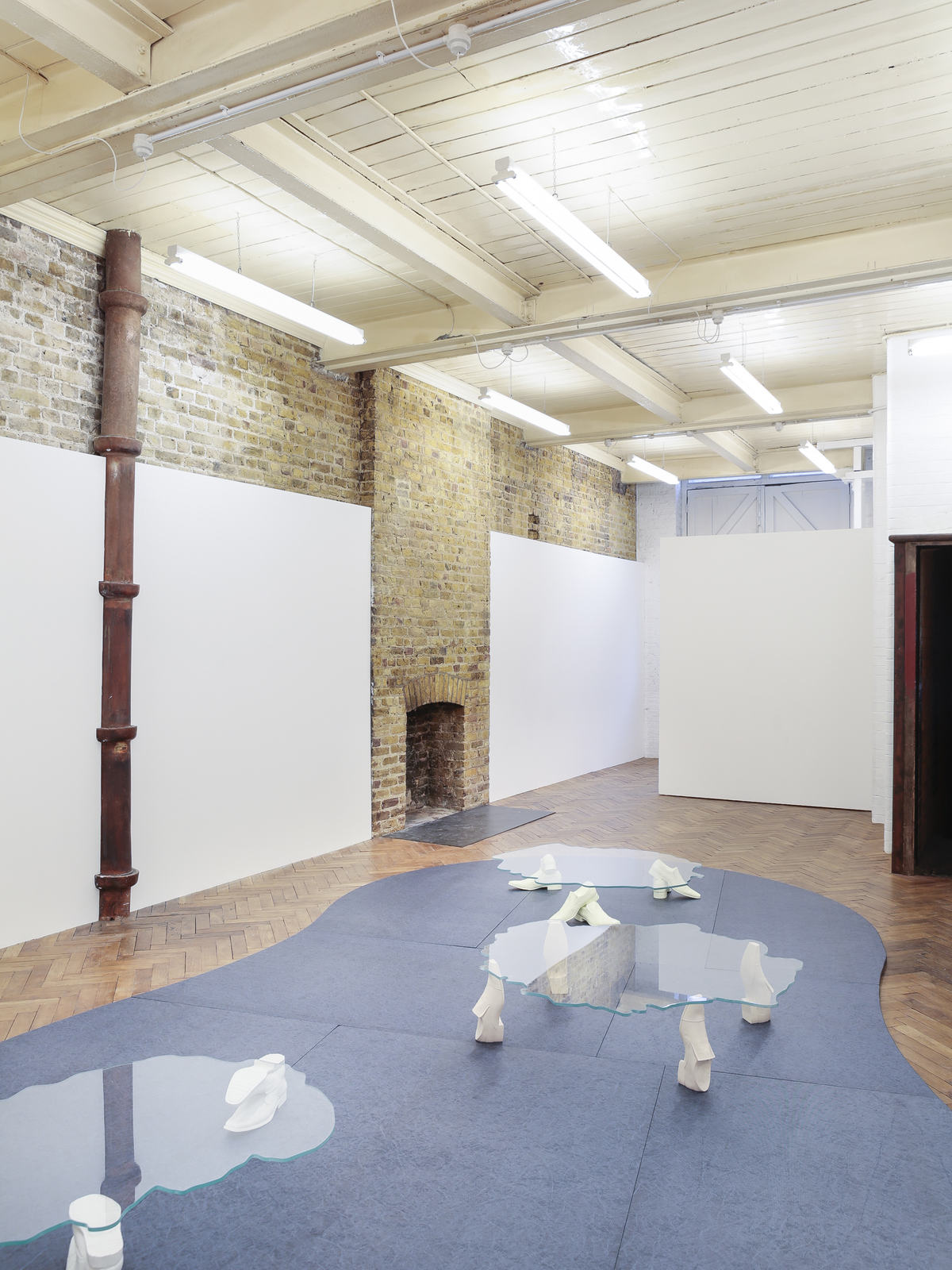
In Gusto, at Studio Leigh, this strategy endures but the objects have been located in a wider context. The Polo Maldinis become the physically supporting element of each sculpture and the sculptures not only refer to their own materiality and proximity to each other as a way to read the work, but also to a specific environment. The environment is made clear by the material; the material examines the cultural cache of place, informed by our own preconception of what that signifies.The exhibition exudes an earthy tone, a flavour of a place, a Mediterranean palette. Plastered surfaces awaiting a fresco, glass and marble objects suggest the outline of people’s faces in profile. The work becomes bodily with feet and heads, human and confrontational. The sculpture locates itself this way but it locates you too. You are somewhere else. Susan Stewart’s extended essay, On Longing, analyses the ways in which everyday objects can be mediated in order to animate a certain version of the world. Examining how a notion of the ‘souvenir’ or a personal collection of objects can infer an abstracted experience of time and space. She writes:
“In most souvenirs of the exotic, however, the metaphor in operation is against one of taming; the souvenir retains its signifying capacity only in a generalised sense, losing its specific referent and eventually pointing to an abstracted otherness that describes the possessor”.[2]
This is how we might view Matt Ager’s works. A coalescence of form, figuration, experience and feeling. An abstracted account of the world viewed through the language of its objects and how they can be heightened through a sensitivity of handling and a provocative interrogation of their cultural value and personal signification. The Oxford English Dictionary reminds us that Gusto is not simply an etymological descendent of the word ‘taste’ or an enthusiasm for enacting something, but also the style in which a work of art is realised.
A folder of Matt Ager’s related research accompanied the invitation to write this piece. As well as brochure images of swimming pool designs displaying the architectural plans of ‘The Venetian’, ‘The Texas’, ‘The Bahama’ and ‘The Copenhagen’, there were thirty or so snap shots from around Tuscany and Northern Italy, Pisa and the island of Elba specifically. Not so much a travel journal but a material diary. Tightly cropped images of the chalky, yellow grain of hard cheese, colliding with the marble counters that they sat on. Close-ups of exuberantly rendered, architectural surfaces showing deliberate apertures left in the walls to reveal the perfunctory brickwork behind. The collusion of different surfaces. Tiles and artificial marbling, shiny car bonnets and the salty deposits of the sea air on glass. Terrazzo flooring, polished to impressive finishes. Geometrically shaped plinths, stuccoed to look organic and rock-like in a shoe shop window. In this I saw a closely observed account of material hierarchies and how differing cultures value the expression they offer. A visible economy of minute decisions being made by craftsmen, DIY enthusiasts, amateurs, experts and charlatans alike. The inclusion of impoverished approximations of quality favoured over the exclusion of the real. Signifiers to a set of values being good enough. An openly inauthentic currency.
We know the differing swimming pools offer nothing other than a slightly altered step configuration, we know deep down that Polo Maldini can’t deliver us the shoes we dream of and we know the marble in our kitchen isn’t marble at all. But we also know the value and the magic that these things do hold. Matt Ager exposes the trick but in his interrogation of our relationship to objects and their signification he speaks more pointedly to our desire to know the world. As Susan Stewart reminds us:
“The magic of a souvenir is a kind of failed magic. Instrumentality replaces essence here as it does in the case of all magical objects, but this instrumentality always works an only partial transformation. The place of origin must remain unavailable in order for desire to be generated”.[3]
Lynton Talbot, October 2016
[1] DKZZZZ, Maldini shoes?, www.styleforum.net/t/20397/maldini-shoes (10th April, 2006)
[2] Susan Stewart, On Longing. Narratives of the Miniature, the Gigantic, the Souvenir, the Collection (Duke University Press, 1993) p. 148
[3] Ibidp. 151
Matt Ager (b.1985, London) graduated from the Royal Academy Schools in 2015 and holds a BA in sculpture from Camberwell College of Art. Recent exhibitions include: Closer to the Veg, London (2016); Maybe Your Lens is Scratched, Averard Hotel, London (2016); Either Those Curtains, Fold (2016); Wrongguns, Agency Agency, Brussels (2016); Is it Heavy or Is it Light, Assembly Point, London (2016); Sunday School #11 curated by Amanprit Sandhu (2015); Studio Leigh Inaugural Exhibition, London (2015); Royal Academy Graduates Show, Royal Academy London (2015); Sheer Like, Lokaal 01, Antwerp, Belgium (2014); Suzuki Montage, Space in Between (2015); Duck Rabbit, Anat Ebgi, LA (2014); Chromatic Leak, NAM Project, Milan (2014); Camel Blues, Kinman, London (2014); Wearing Potentiality (curated by Attilia Fattori Franchini), Paradise Row, London (2014); Premiums, Royal Academy Schools, London (2014); Open Cube (curated by Adriano Pedrosa), White Cube, London (2013).
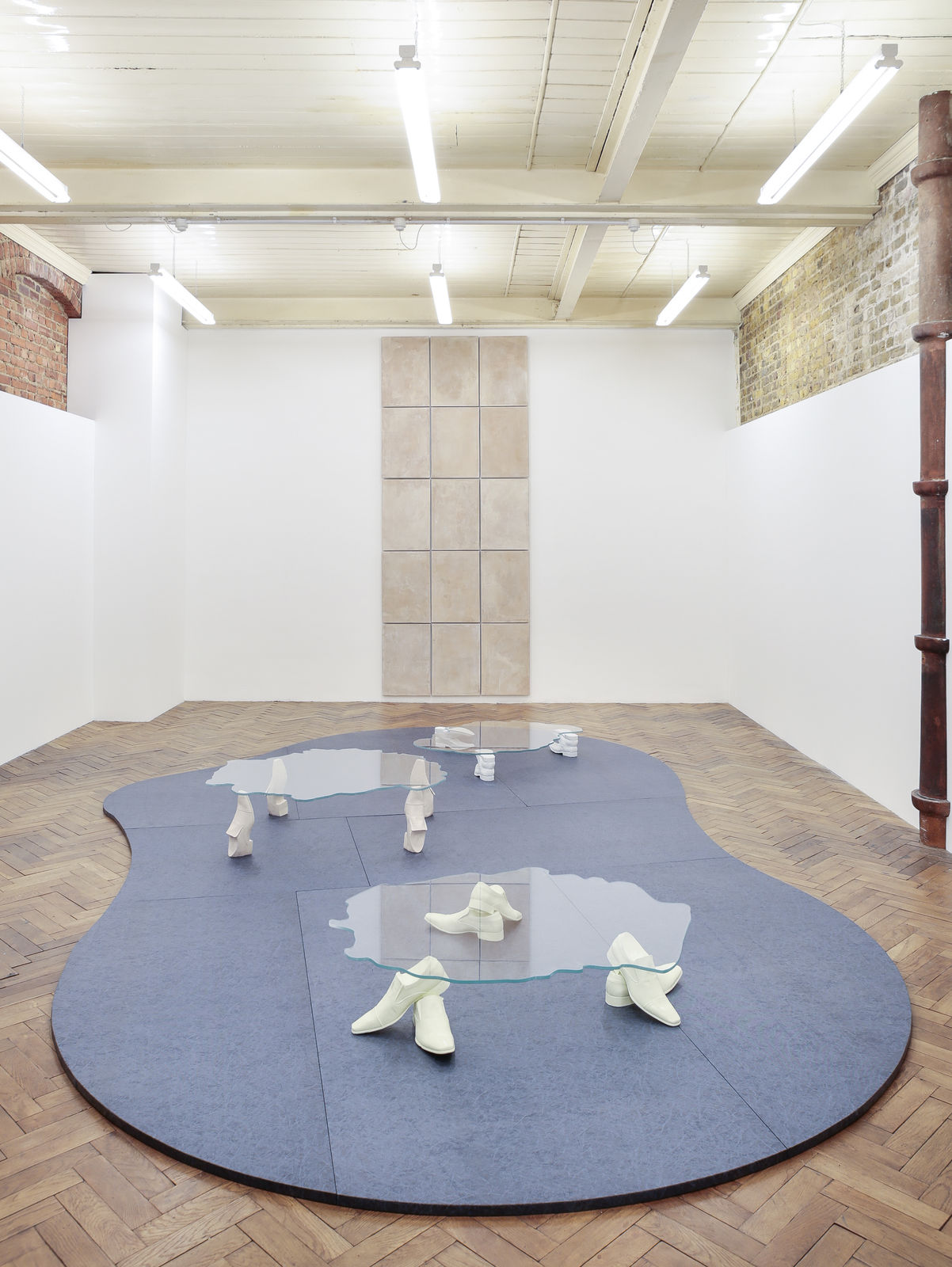
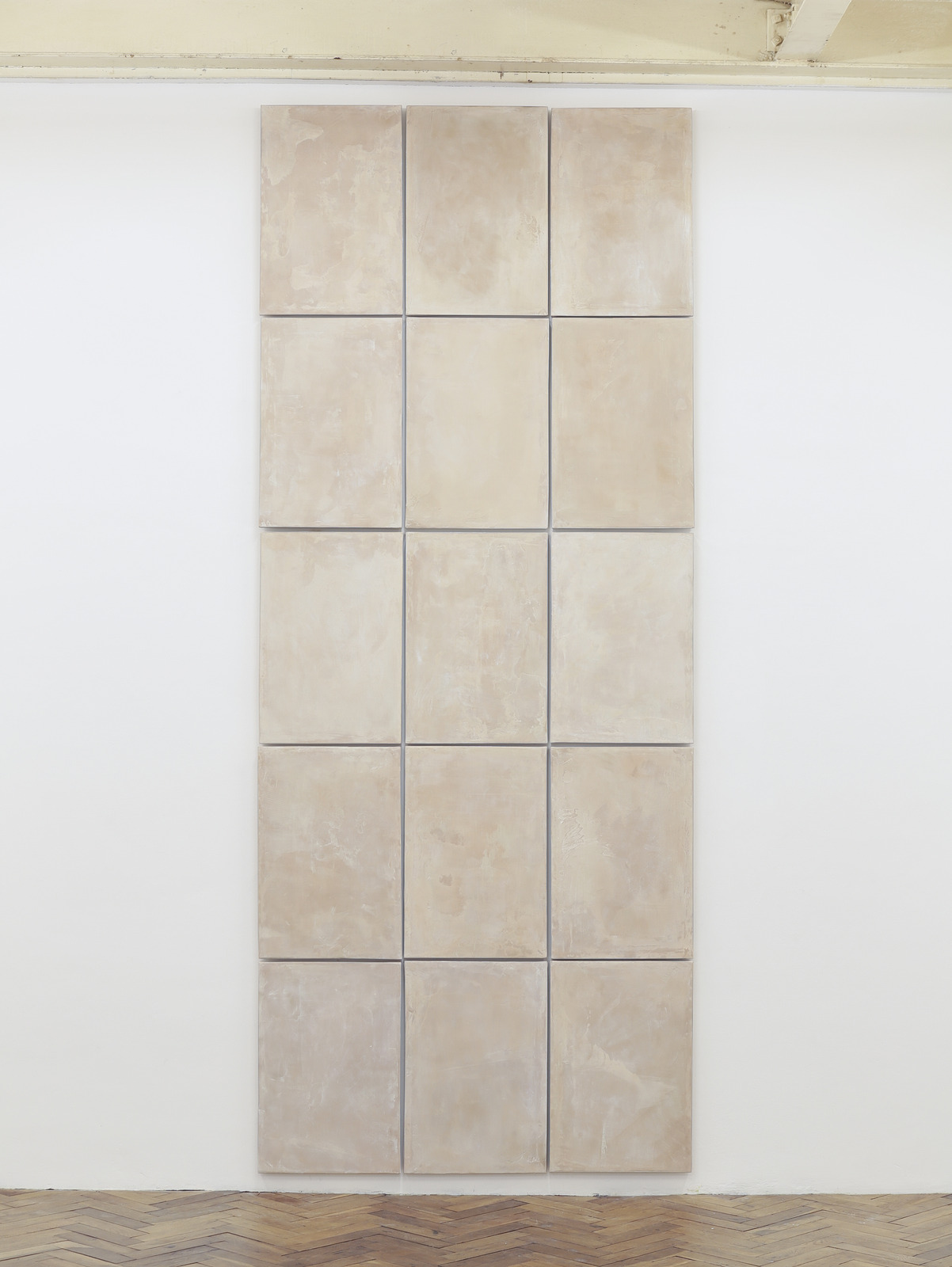
Matt Ager, Puro 15, 2016, Plywood, plasterboard, skimming plaster, aluminium beading, 135 x 325 cm (dimensions can vary)
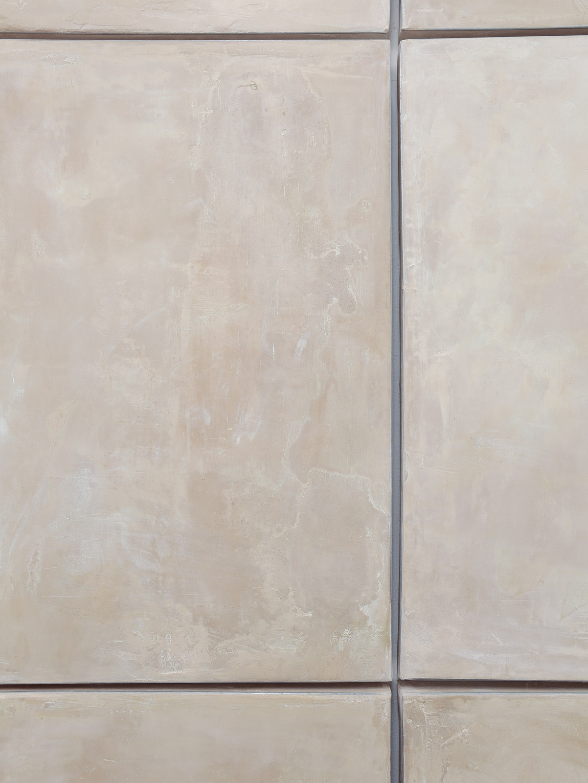
Matt Ager, Puro 15, 2016, Plywood, plasterboard, skimming plaster, aluminium beading, 135 x 325 cm (dimensions can vary)
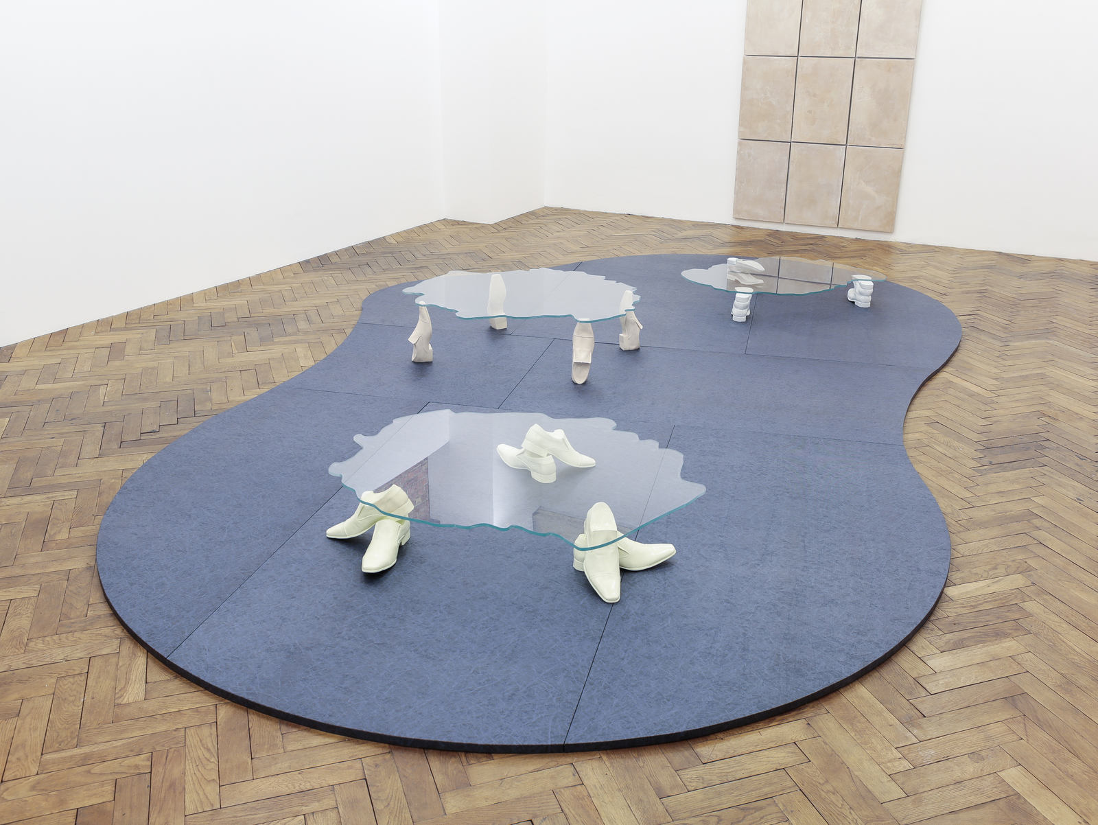

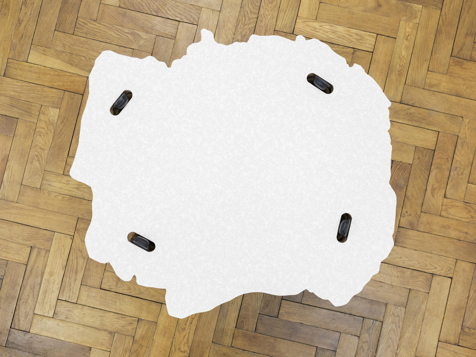
Matt Ager, Casual, 2016, Glass and Jesmonite, 117 x 107 x 30 cm
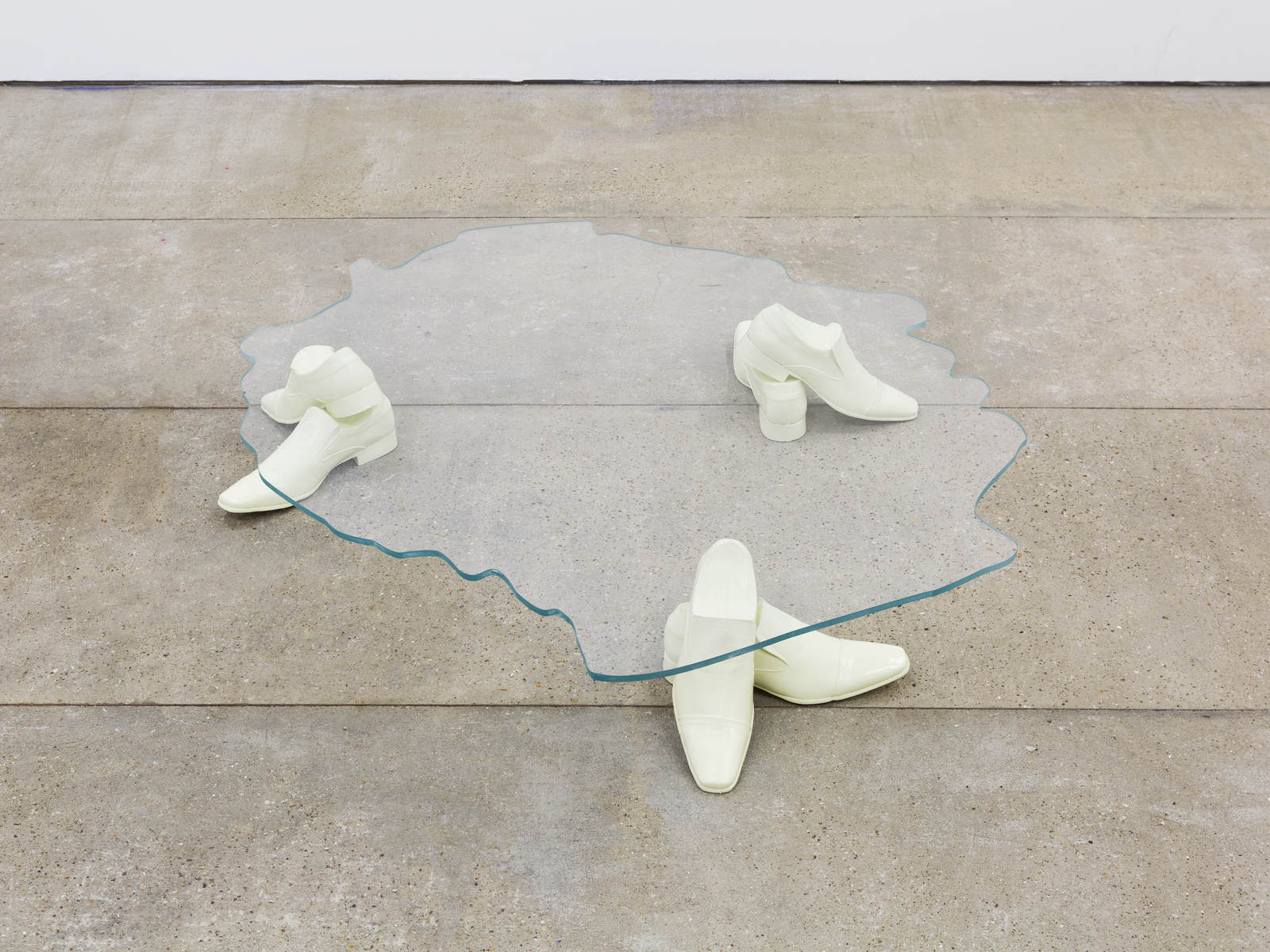
Matt Ager, Dress and Work, 2016, Glass and Jesmonite, 114 x 102 x 22 cm
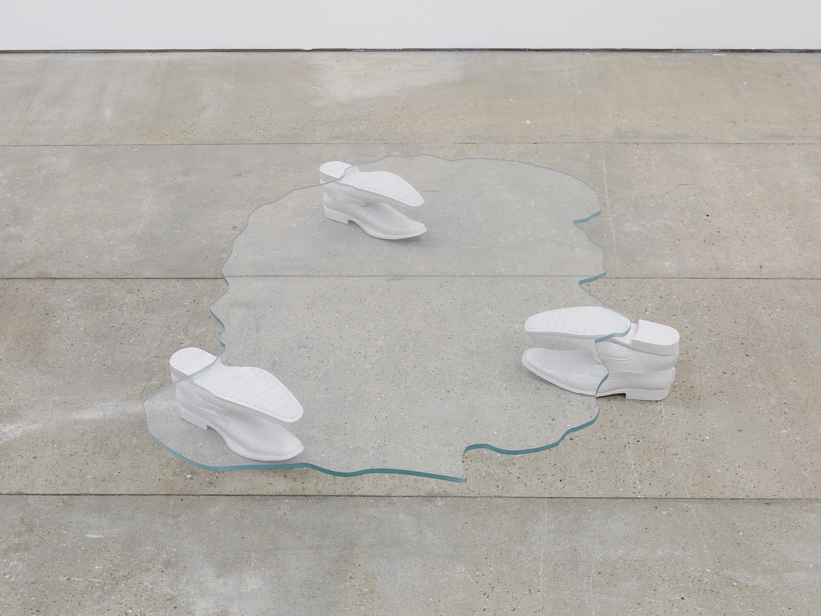
Matt Ager, Cultured, 2016, Glass and Jesmonite, 115 x 100 x 15 cm

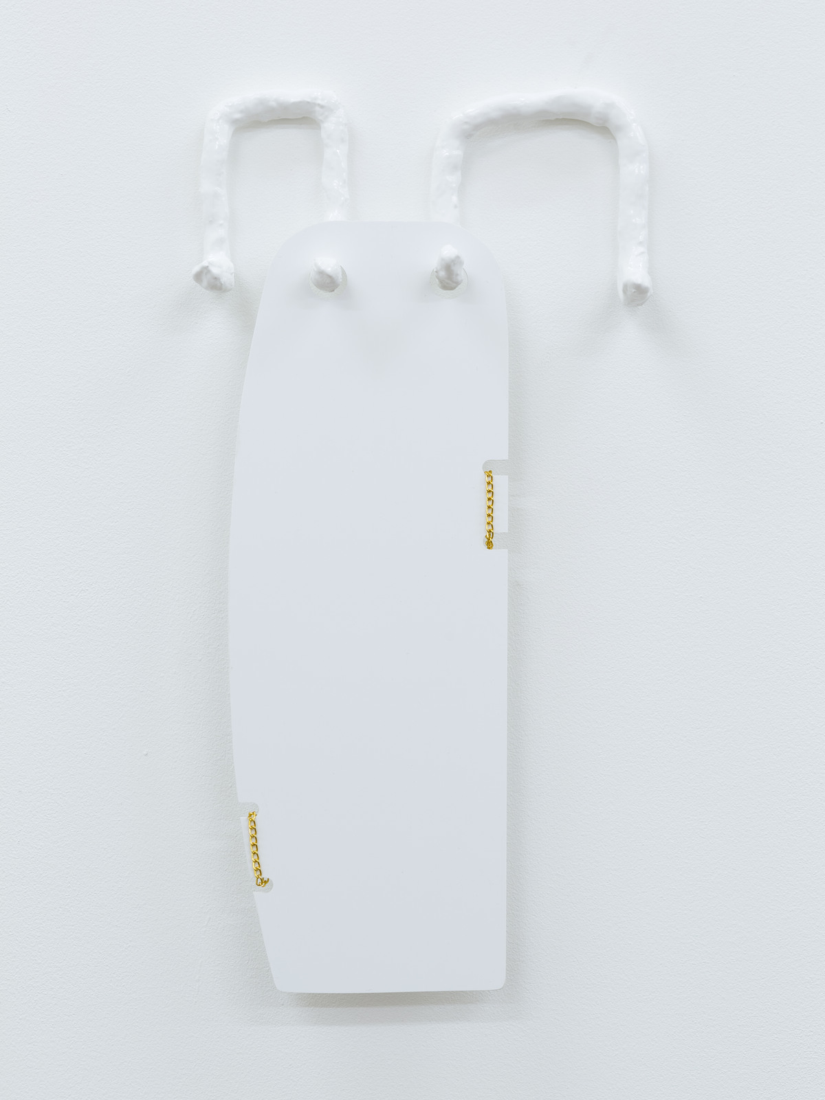
Matt Ager, Back Home, 2016
White perspex, plaster, paint and fake gold chain, 27 x 38 cm

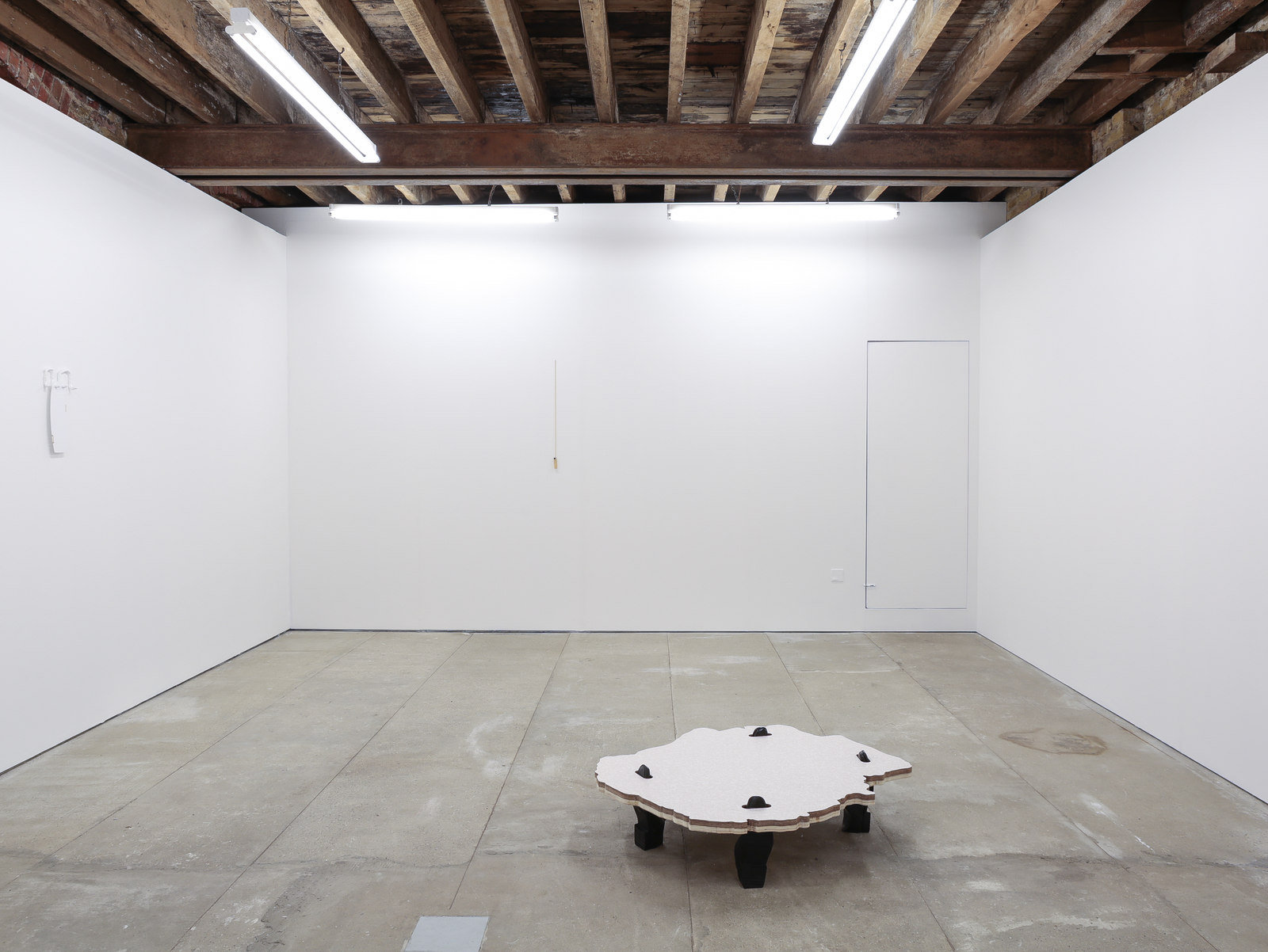
Matt Ager, Endless Use, 2016
Formica, ply, Jemsonite and shoe polish, 100 x 85 x 26 cm

Matt Ager, Endless Use, 2016
Formica, ply, Jemsonite and shoe polish, 100 x 85 x 26 cm
Matt Ager, Endless Use, 2016
Formica, ply, Jemsonite and shoe polish, 100 x 85 x 26 cm
Matt Ager, Time Apart, 2016
White perspex, plaster, paint and fake gold chain, 20 x 39 cm

Matt Ager, Chain Glaze, 2016, Lighter and fake gold chain, 81 x 3 cm

Matt Ager, Puro 16&17, Plywood, plasterboard, skimming plaster, aluminium beading, 2016, 90 x 65 cm