
Artist: Francesc Ruiz
Exhibition title: Pire, Miche, Yoko, Stone…
Venue: CIBRIÁN, San Sebastian, Spain
Date: May 17 – July 6, 2024
Photography: all images copyright and courtesy of the artist and CIBRIÁN, San Sebastian
Note: Exhibition floor plan is available here
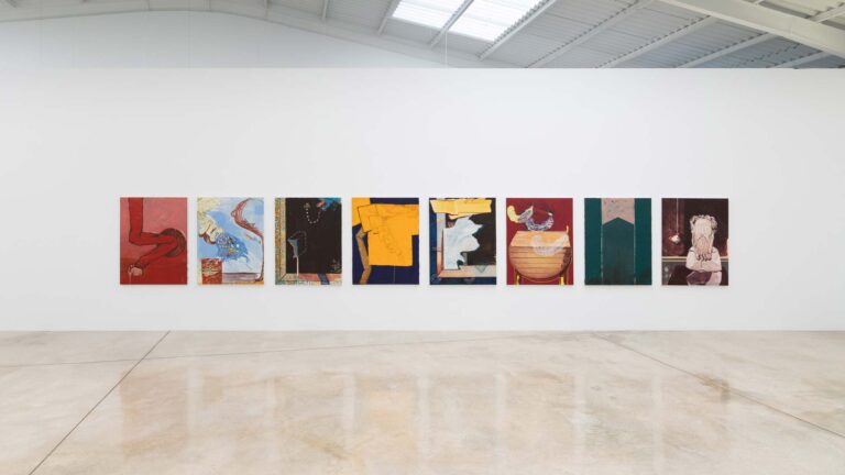
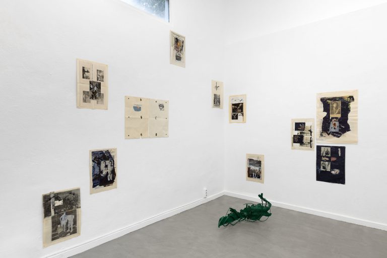
Cibrián: For your exhibition Pire, Miche, Yoko, Stone… at Cibrián, you show seven sculptures that take the form of mailboxes. On these sculptures, self-contained units, the viewer can see logos of printer/plotter, tire and prepaid telephone international companies, as well as nameplates with sloppy handwriting, traces of unknown inhabitants. The proliferation of mailboxes in the space and their symbolic generosity leave the viewer facing an experience both common and unique. Can you tell us about the origin of these works?
Francesc Ruiz: The exhibition shows a body of work that epitomizes the installations I made at the CA2M in Móstoles in 2020 and at the EACC in Castellón in 2022, where I was able to work around the idea of printed capitalism coined by Benedict Anderson, but expanded on the one hand to what I call the printernet and on the other hand to what would be a very particular vision of contemporary logistics.
Anderson establishes a relationship between the emergence and evolution of the printing press and the development of imaginary communities that construct the idea of nation. An example of this would be how the daily press helped to implement the notion of belonging to a territory or citizenship. An important part of my practice has been understanding newsstands as a place from which analyze specific contexts, dismantling the way in which status quo is constructed.
In 2015, I started to expand that notion of printed capitalism to the contemporary urban landscape, which I relate to the development and cheapening of technologies associated with large-format printing. Banners, vinyls, etc. cover the façades of buildings, shop windows, buses, vans, and trucks. They are configured as a skin or an adhesive architecture. This printernet, allows you to download a logo or an image from the web and print it at the size you want; it even allows you to print entire cities at real size.
At the same time, the idea of distribution that I had developed in all my work around expanded comic becomes of interest to me from a new perspective. I start a whole research around several axes: global logistics, the genealogies of what I call art-distribution, the possibility of queer logistics, as well as a negative perspective on all that through the idea of disappearing or being taken out of circulation.
Coming back to the body of work that I show at the gallery, the mailboxes gather all those interests that I have mentioned; they are prints, posters, and signs in a material that looks like foam board and that we associate with architectural models. The mailbox is nothing more than a model of a building, a summary of it, where the idea of private property is represented on a small scale, but also that of community.
The logos we see here refer to companies that print in a broad sense: plotter manufacturers, tire brands, and a cell phone company, Lycamobile, which between 2015 and 2020 ran a very invasive urban communication campaign, covering the stores that distributed its prepaid cards with vinyl.
The mailbox is the final place in the supply chain, in a world where we no longer send letters, but receive packages.
ML: Transitivity, transgender, transexual, transition, these are actually all words that describe a body in motion, and therfore, by definition, that body is in a state of instability. (Jack Halbertsam, excerpt of a lecture at Columbia University, New York, June 6th, 2023, published on the occasion of the 10th edition of Many of Them.)
If we extrapolate Halberstam’s thinking, like that of many gender studies thinkers of the last decade, we can intuit parallels between logistics and queer, since both are built on an in-between, unstable state of a body or a commodity. Your work has often focused on the construction of the urban landscape as liminal spaces. Is a queer reading of these urban spaces possible?
FR:
I understand the queer logistics, to which I sometimes refer, as that set of systems of operations that allow “other” lives to be livable. There is a logistics of queer desire that breaks with the notion of heteropatriarchal space-time. There is a logistics of the closet that allows living under repressive regimes.
There is a logistics that emerges from the AIDS crisis that will manage care, and protest, and it will revolt against health policies and pharmaceutical industry protocols. There is a queer logistics in how we decide to rename ourselves beyond the gender given and the medical-administrative impositions imposed at birth.
There is a trans-logistics system that distributes drugs, hormones and transitive spaces. There is a queer logistics in how the idea of family or community is managed. There is a transmigrant queer logistics that manages in adversity to survive under a transphobic, xenophobic and racist system.
My genealogy of references that participate in this queer logistics begins in the Mail art of Ray Johnson and in fictional characters such as the superhero Danny The Street, created by Grant Morrison, a transvestite street that appears and disappears in different places and times to give shelter to those who live in the margins.
I also believe that there is a poetics of queer logistics that is organized on the road, on the run, in the rest areas, in the industrial states, in the trucks and their trans/carrier iconography, reconverted into bars or dark rooms, in the leather, bear and butch subcultures, in the feminine masculinities.
In the mailboxes, this queer logistics is also reflected in the different textures that the names inscribed on the nameplates configure and that indicate different levels of citizenship and legality. People who cannot name themselves, people who have decided to name themselves differently, people who are afraid of being identified but who need an address to receive a drug that allows them to live.
ML: You are perhaps best known for your research around comics, which you use to tell alternative stories, especially those that arise through the construction of a homosexual imaginary within a heteronormative society. The relationship between drawing and the printed matter, and by extension, lettering, runs through your work. Can you tell us how you move from one form to the other, if they are distinct practices for you? And how have those practices influenced your latest body of work?
FR:
Comics have been a format with which I have been able to express myself and develop research around uncomfortable or little-known spaces: the Arab comics, the gay comics created by people outside the collective, and the alternative hentai as a borderline space for representation.
The comic has allowed me to establish a methodology for approaching specific contexts, times, and places. From the architecture and basic grammar of comics and situationist techniques such as détournement, I have been able to give voice to the covers that make up the skin of newsstands and speculate on possible imaginary communities. This, in turn, has allowed me to dismantle all the graphic codes that make up printed communication.
On the other hand, I have always defended the total relationship between comics, architecture and urbanism. Walking down a street and seeing the shop windows with their signs and mannequins is very similar to reading a comic strip. One of my initial references was “13 Rue del Percebe” a comic strip by Francisco Ibañez, which is our comic book version of Perec’s “Life: A User’s Manual ”. If we go back to the mailboxes, I think they can also be read through the lens of comics; if you look closely, they are just sets of panels with inscribed texts that tell us who lives there.